Curated Article Newsfeed
Texture | 2016
Mobile, Tablet, Chromebook, & Kindle app
Background
In 2016, Texture started diverting focus from the full-magazine reading experience to shorter story-based reading in a new section called “Highlights”. The intent was to provider shorter-consumption content that drove retention and attracted the younger demographic that was less dedicated to magazine brands and more interested in topic search and resulting content.
Design for the new Highlights feature started fairly open-ended and was later narrowed down into a simpler-to-developer experience in the end release.
About Texture
Texture is a magazine-reading app where you could follow and read issues from over 200 magazine brands. Texture also provided a newsfeed section called Highlights, where users could read curated articles or recommendations based on their reading habits.
Key Highlights
- Feed-based flow of articles for shorter duration reading sessions
- Customizable layout for content managers to surface desired content “above the fold”
- IA flows that continue reading flow into magazine brand hubs for further reading
- Further conceptualization of a “periodical”-based experience to entice daily retention
Process
Ideation
Focusing on this goal of daily app check-ins, I brainstormed a few approaches to an article feed, attempting to push and explore the possibilities and what type of user experience would incentivize a user to return to our app without notification prompting or gamification.
As Android OS went through updates and provided smoother support for custom theming, we took advantage of these changes to meld our brand’s look with the expected look and feel of native Google apps using Material Design (circa 2015-2016).
Brainstorming in high fidelity, one of the proposed solutions was to provide a grid-based feed of "latest content" that mixed issues, articles, and collections in 1 view. This made "Highlights" a "latest from your account" screen.
Another brainstorm in high fidelity, taking the idea of a grid-based feed in a different way, each day's new content would be separated into its own section.
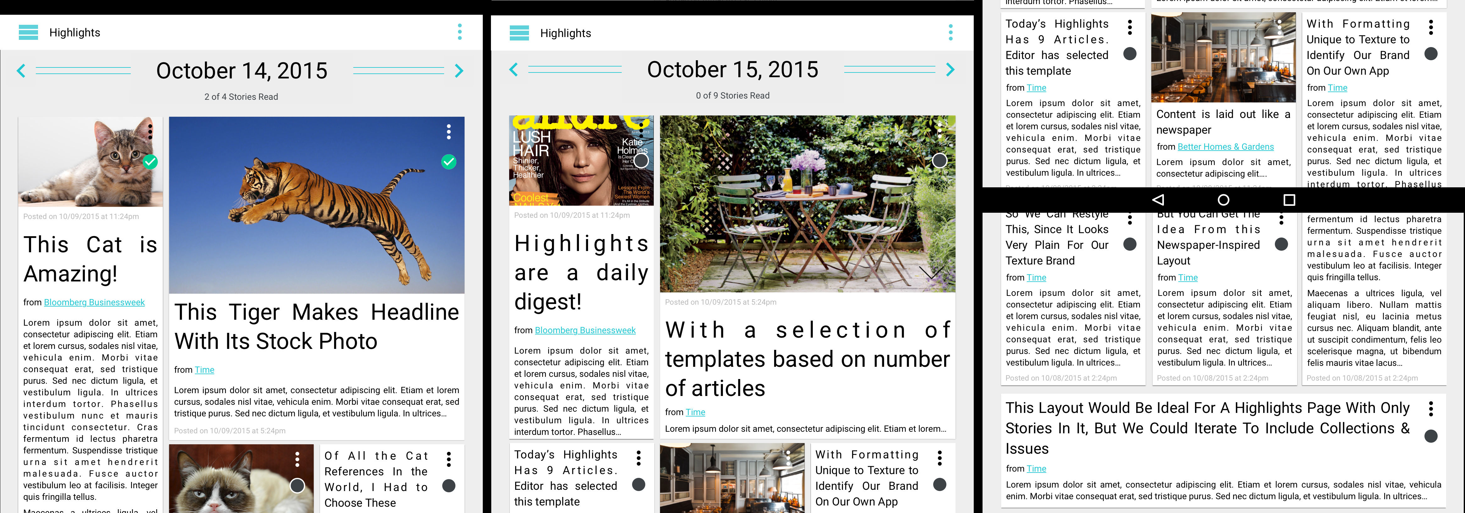
This proposed concept took inspiration from periodical front pages. Rather than a grid of thumbnails and summaries, we'd show headline images, and the beginning copy of each featured article. Tapping through would "jump" the user to that story. And yes, lolcats for placeholders. :)
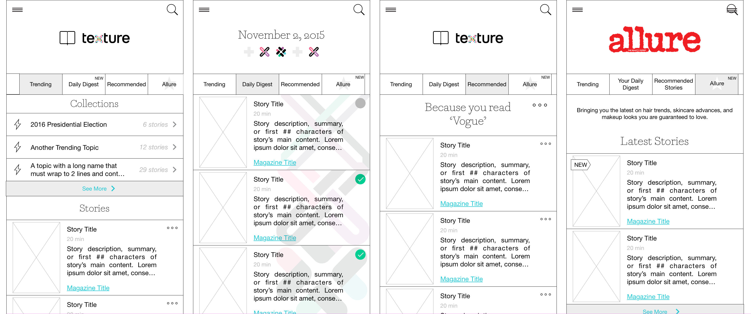
We even took it as far as brainstorming what would happen if we removed issue-based reading all together and provided a feed-focused experience for our mobile users. This was ultimately rejected as it neglected our core userbase, but was worth exploring during the conceptualizing phase
These ideations proved useful to the team and stakeholders because it allowed us to see the range of possibilities we could take in order to increase returnability. However, in order to maintain a level of flexibility and speed in development, we decided to create Highlights as a separated section of content and not continue down the path of trying to integrate into a continuous content stream (the 3-column continuous grid). We also decided to nix the periodical concept due to its complexity and restrictions on editorial.
MVP Designs
Once we decided to have a clear separate section for short-duration article reading, I brainstormed ways to display this section that was informative as well as eye-catching. Brainstorms ranged from a list-like view to ones where the thumbnail was most prominent.
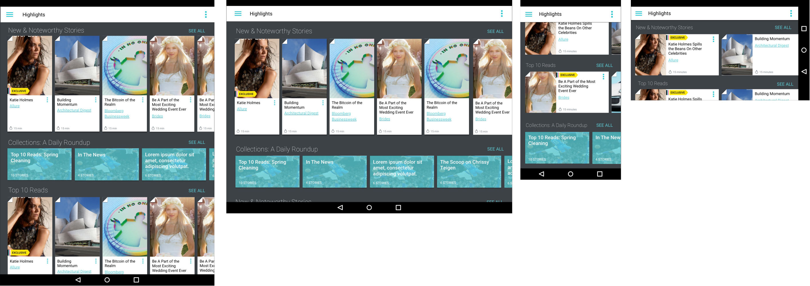
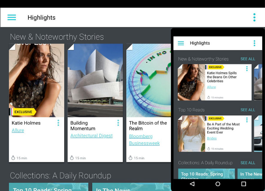
A carousel-based layout with theme-able rows and organizable content based on editorial input
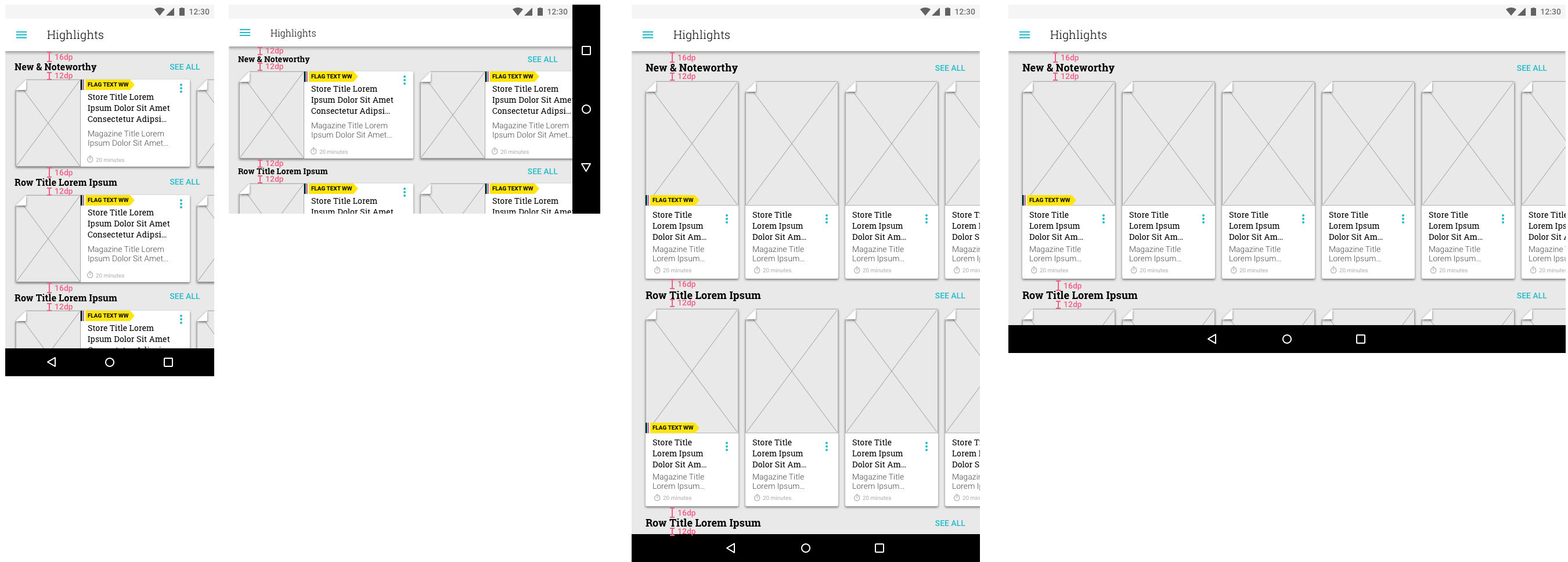
Wireframes of the chosen layout after brainstorming.
Follow-up Iterations
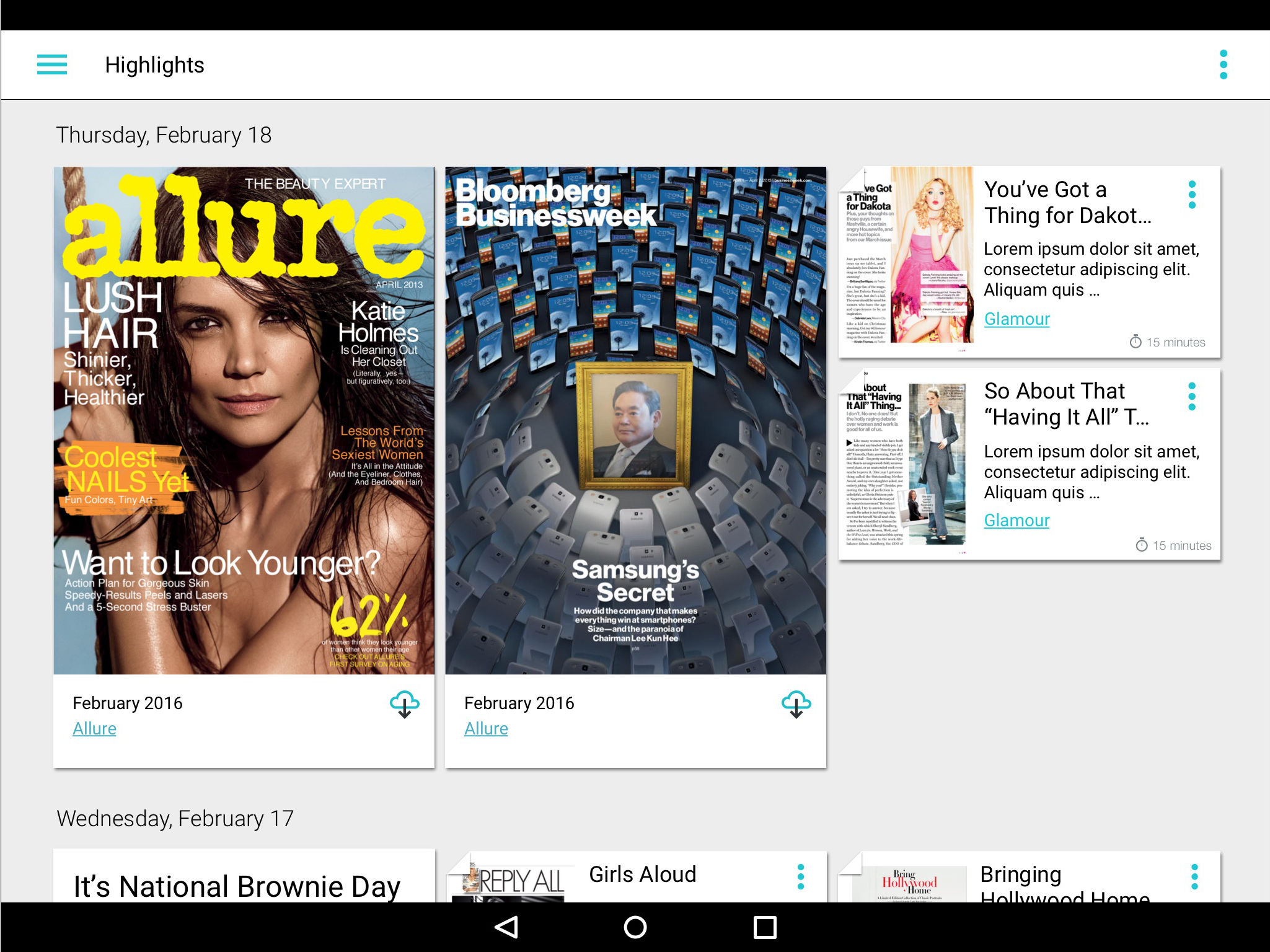
This feature released as the above carousel layout, but was further tweaked in future releases:
- Removed the text link from the magazine title and moving its functionality into the overflow (usertesting showed the text link caused mistaken taps)
- Removed the folded corner of the card (while informative, it was expensive to maintain and ultimately did not provide enough benefit to warrant costs)
- Changed the article cell to a consistent format across platforms (copy cutoffs were more predictable with a responsive grids and a consistent cell layout)
Design iteration and review continued until one was committed to the sprint and implemented.
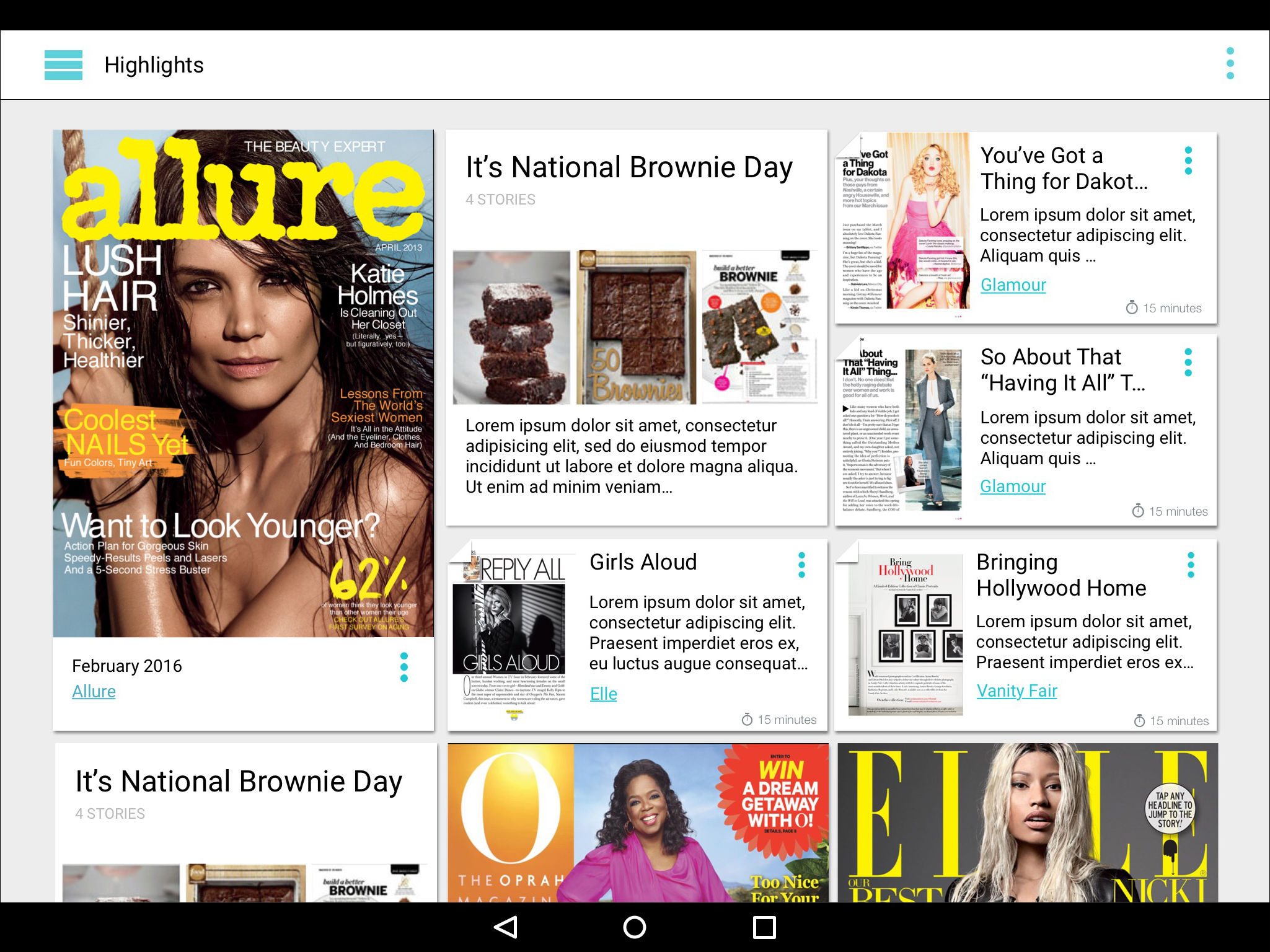
Further brainstorming of the article cells, laid out in different screen widths to test on devices before committing to sprint.
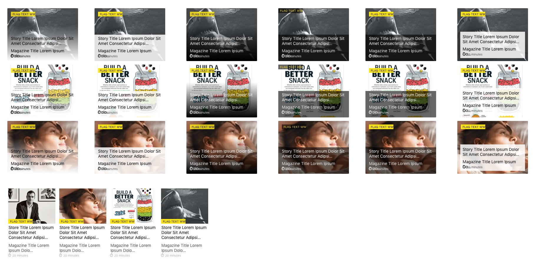
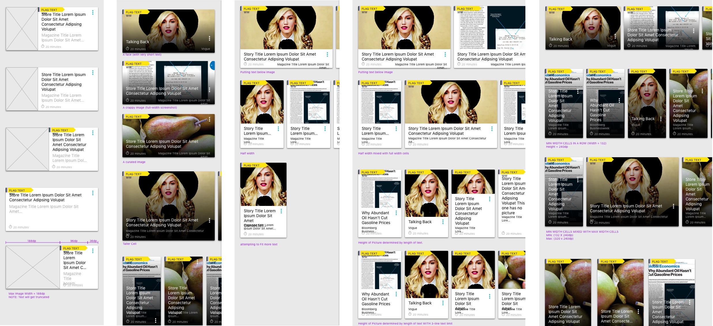
Brainstorming cell layout against various thumbnails as we weren't always in control of what image was displayed.
By the end, we had proposed and added to dev queue a version of Highlights that visually differentiated stories, featured stories, and magazine issues in a way that highlighted the aesthetics of the article's photography while maintaining a Texture brand presence.
Later on, when Android OS made using custom fonts more optimized, we further updated this by adding our branded font. Combined with the clean layout, this helped tie this screen into a solid "Texture" feel.
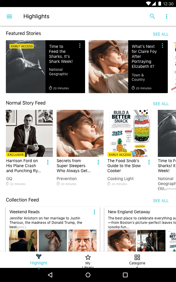
Final layout of the newsfeed feature as of 2018